
Everyone is familiar with YouTube; the video-sharing site averages more than one billion viewers each month! But the videos we watch vary by age, gender, geography, and more. The most popular video watched by men is likely not the same as the most popular video watched by women. And don’t forget about variations in culture across the U.S. The viewers in New York have very different habits than do viewers in Texas.
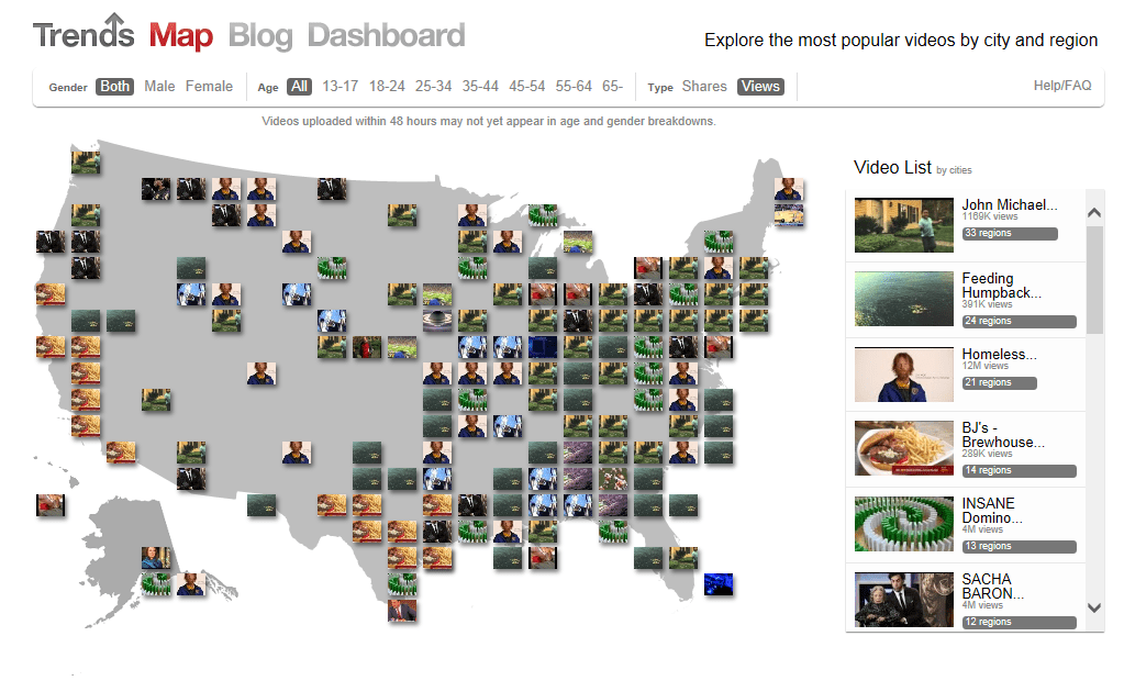
YouTube posts a daily trends map based on demographics as reported by its account holders. Rankings are based on the number of views and can be separated by age, gender, and location. Through the aggregated data, YouTube Trends show us the most popular video in real time and gives ideas about trends that are developing within the YouTube viewing community. The map is a visual representation of the most viewed videos over the past 24 hours across the U.S.
Before you look at it, take a guess. What do you think the most popular, trending videos are this week? Then click on the interactive map to discover trends and viewing behaviors.
Group Activities and Discussion Questions:
- Poll students: What are the YouTube videos they watch the most?
- What videos do they think are more popular for men vs. women? By various age groups?
- Bring up the YouTube trends map: http://www.youtube.com/trendsmap
- Divide students into teams. Have each team select a specific target market and geography and view the most popular videos in that area.
- Discuss how this information can be used by marketers.
Source: YouTube.com


